Written by Kate Curry
What Is Color Theory & Why Is It Important?
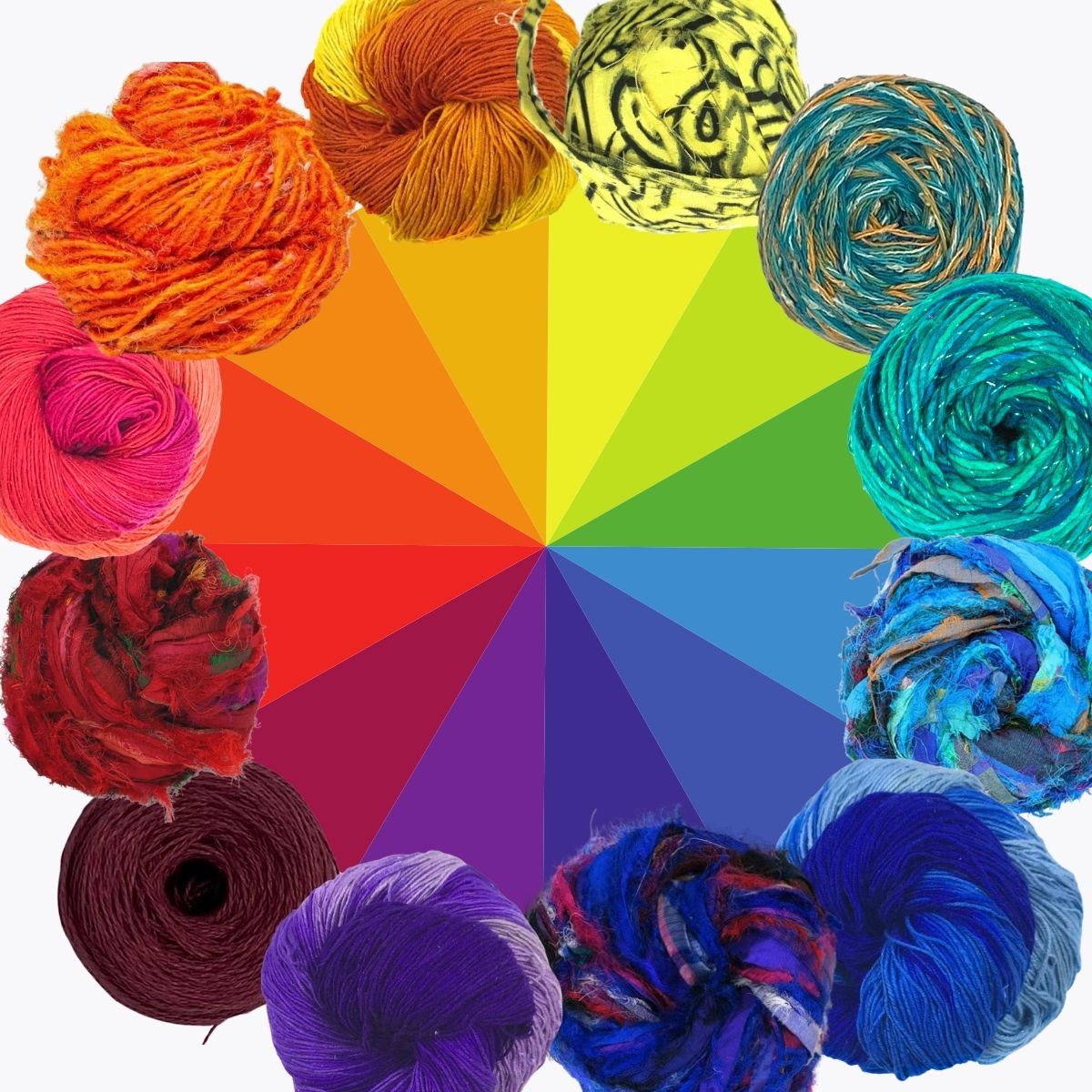
For hundreds of years, artists have been using color theory to create their masterpieces. They weren’t just randomly grabbing colors! Each color included in art is chosen specifically to send a message to the viewer. The color wheel that you’ve seen in every art classroom is based off of Sir Isaac Newton’s color wheel from 1704. Using color theory helps guide the artist to choosing eye-catching color combinations and designs.
How To Use A Color Wheel
A color wheel helps you see the relationship between colors. Have you ever been working on an art piece, randomly choose two colors, only to realize 😳 ohhh….that’s kind of ugly. By using a color wheel, you can avoid those situations!

Using a color wheel will help you find:
- Complementary colors
- Analogous colors
- Triadic colors
- Split complementary colors
Important Color Factors & Terms
While you’re looking for some inspiration, you might see other artists toss around terms like achromatic color combinations and tone when describing their color palette choices. We have a few color theory vocab terms and examples that can get you started!
Colors
- Primary Colors: These are the main three colors (red, yellow, and blue) that are used in different combinations to make every other color

- Secondary Colors: These colors (green, purple, and orange) are created by mixing together the primary colors

- Complementary Colors: Colors that are on the opposite sides of the color wheel and can create contrast.

- Tertiary Colors: These colors are created when a primary color is mixed with the nearest secondary color


Elements
- Tint: A tint is any color mixed with white - think of pastels
- Value: How light or dark the color is.
- Shade: A color that is mixed with black to make it darker
- Tone: Refers to the darkness or lightness of a color
- Saturation: How “pure” a color is. You can change the saturation of a color by adding gray or a complementary color.
The Psychology Of Color Theory
Colors have, and always will, have a psychological effect. There is no universal meaning for colors though, as the meaning behind color can depend on the culture, heritage, and emotional reaction of the viewer. What one person might see as their ‘sad color’ might be another person’s happy color.
When you’re creating, be mindful of what colors you’re working with and what emotions you want to convey in your art. If you want to convey a warm, sunny day at the beach, you’ll want to use shades and tones that remind you of warm tan sand, cool blue water, and bright and happy beach umbrellas.
Finding Inspiration And Making A Color Palette!
You can find inspiration all around you! In music, art, nature, and your loved ones. Before you start creating, think about what your inspiration is and how you want people to feel when they look at your art. Do you want them to look at your scarf and think - wow, that reminds me of cold winter nights when I had to snuggle up in a blanket? Art can make a viewer recall and reminisce on the past - and you’ll need to do a little bit of color planning before you get to creating!
The best way to create your color palette is to take pictures of the yarn you have in your stash and upload them to a site like canva. We love canva for making art here at DGY and they have a ton of fun templates that you can use to help you create your color palette.
For example, I’ll be using a picture of our artisans for inspiration for a color palette

How To Pick Your Yarn
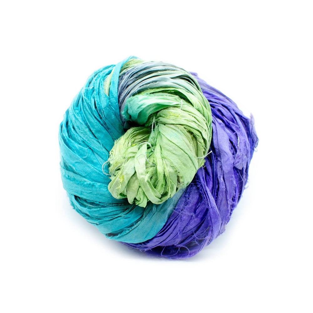
Once you have your palette, it’s time to finally pick your yarn. You may have the yarn color you want in your stash, or you may have to go hunting for that perfect color that you’ll need. Thankfully, there are millions of different colorways of yarn - so very rarely will you be unable to find a specific color of yarn.

Texture, material, and weight is very important, too! I’m not saying you can’t mix and match different yarns, but do some experimenting with different mixes before you sit down and start the hard work of creating!
You’ll also have to plan out your pattern and how you want to mix your colors. Do you want one color to be the main focus and the other color(s) more for accent? Which color do you want to pop, or do you want the colors to blend? Do you want to have your colors mixed together? Or striped? Or maybe in a specific pattern that makes a shape?

Mixing Your Yarn Colors
When you’re putting together colors, there are a few options!
- Blending / Mixing Yarn

- Horizontal Stripes

- Vertical Stripes

- Diagonal Stripes

- Squares

- Chevron

- Waves

- Ombre

- Spiral

- Dots

- Scaled

That's just to name a few!
Conclusion
I hope this guide helps you the next time you get crafting! We'd love to see what you make! Use #darngoodyarn or tag us on Facebook or Instagram so we can see your creations !
 Rewards

