Back in December, the world’s commercial color authority Pantone announced that the “Color of the Year” for 2020 would be Classic Blue. This led me to wonder why. What on earth goes into such a decision and what does the process look like? Let’s take a look at the history behind the color of the year and what Classic Blue might mean for our year ahead.
Since the year 2000, a company called Pantone has regularly given each new year (with the exception of 2016, which greedily had 2 colors) a color to describe the collective mood of humanity as it existed at the time. As the company puts it, “color has always been an integral part of how a culture expresses the attitudes and emotions of the times.” Pantone is best known for its color matching system which allows for a high level of color accuracy in printing as well as paint, textiles, and other applications. But how does the color giant come up with a single color to symbolize humanity for a year?
Well, apparently they meet in secret and the decision process is left a mystery to us mere mortals. I’m certainly picturing the color bosses representing their favorite color in a competitive paint and sip competition, but I’m a romantic. I’d like to think there is at least a little bit of science involved, but what to measure? There are so many contributions to art, design, advertising, and fashion every day that it all gets a little overwhelming sometimes.
Maybe it’s simpler than that.
Pantone has described colors of past years as representing broader moods. How they measured the collective vibes of every person is an interesting question, but simplifying things down to a collective desire is as good a place to start as any. Past colors have been chosen to signify celebrations, boost our morale, or ward off the stresses of modern life. It definitely fits; the majority of colors chosen since 2000 are vibrant, bright, or pastel “feel-good” colors. I’m a big fan of 2016’s pastel “Rose Quartz” simply because it reminds me of a cozy hand-knit blanket I use constantly.
Colors can do amazing things like help us feel good and lift us up. They can inspire creativity or remind us of fond memories. This year’s Classic Blue reminds me of waiting for the first star of the night as I stargazed with my dad as a kid. It’s a perfectly calm and serene blue. What does it remind you of?
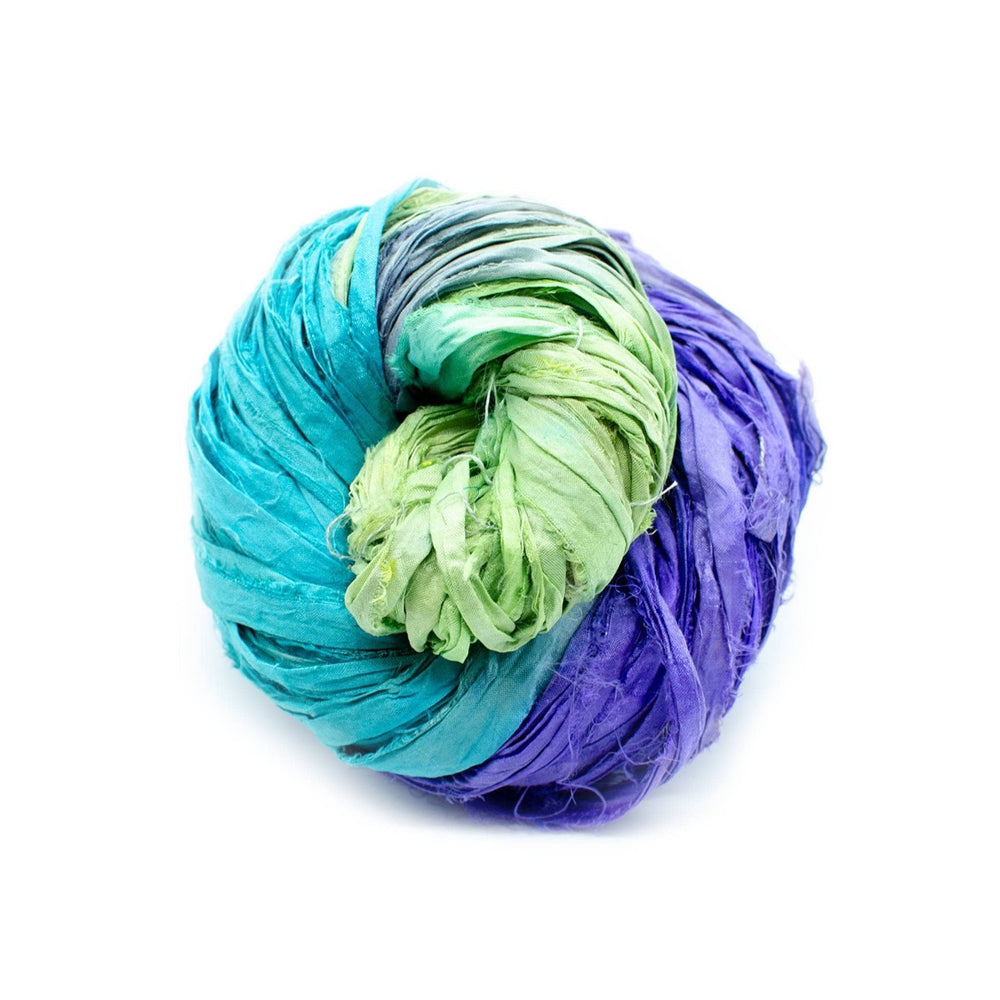
In honor of this year’s color, we’ve picked out a few matching yarns in case you want to get inspired by your own interpretation of Classic Blue! Not into blue? Freaked out a little by the blue man group like I am? No problem, we carry the rest of the rainbow too. Happy creating! - Cam
 Rewards


