Written by Michaela MacBlake Matthews
For The Turquoise Soul
What does the color turquoise signal to the brain? How does it make us feel? How is turquoise different from blue or green?
In pigment mixing, turquoise is on the cyan side of blue. It has the slightest touch of yellow mixed in, and is brought up from teal by adding white.
Turquoise has the calming effect of light blue, mixed with invigoration and energy from the subtle touch of yellow.
The shade ever so slightly leans toward green, though it simply looks blue to the naked eye. The faint greenish tint gives turquoise an undertone of health, while still predominantly radiating the mental and intellectual hue of blue.
Turquoise brings together the childlikeness of baby blue, or robin’s egg blue, with a bit of added thought. While the darker hue, teal, is the color of curiosity, turquoise brings with it an air of passive discovery.
Turquoise is a wonderful shade to embody travel, meeting new people, and exploring education!

When paired with a darker blue, it has a calm and respectable demeanor. With a dark forest green, it takes on the energy of new beginnings and the path to long-term health.
Use turquoise in your creative projects to bring in a tone of calm and curious exploration. It is a great color to try new techniques with, or to explore ideas that have been waiting for their chance to shine! This strong and lighthearted shade of blue falls between the blue of the sky and the green of the earth, and represents the place where our imaginations
Our Fave Turquoise Products
Sari Wrap Skirt - Lagoon
Turquoise Bags
Turquoise Jewelry
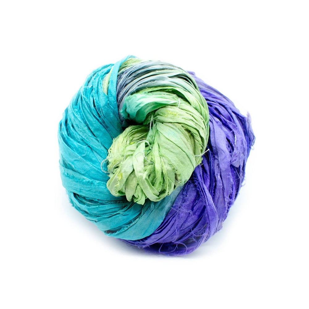
Turquoise Yarn
 "Mac" is on the Lifestyle Team here at Darn Good Yarn, and loves taking a ‘teach a man to fish’ approach to creative therapy. She is certified in neuro-linguistic programming, and is also the surreal artist and author behind Surrealismac.
 Rewards


